Typography
Typography is one of the platform's core components, as it guides and helps users understand and interact with the content. Applying established typographical rules to interface elements allows us to convey the content in a clearer and more effective manner. Simply put, good typography is invisible.
Platform Typefaces
In the platform, Satoshi Variable is used for headings and Inter for general content.

Size and Weight
Size and weight are two important typographical variables that can help emphasise and establish the textual hierarchy. These two variables must be balanced in order to provide the correct expression. A text with a heavier font will always carry a greater emphasis than one with a lighter font, even if the text size is the same.
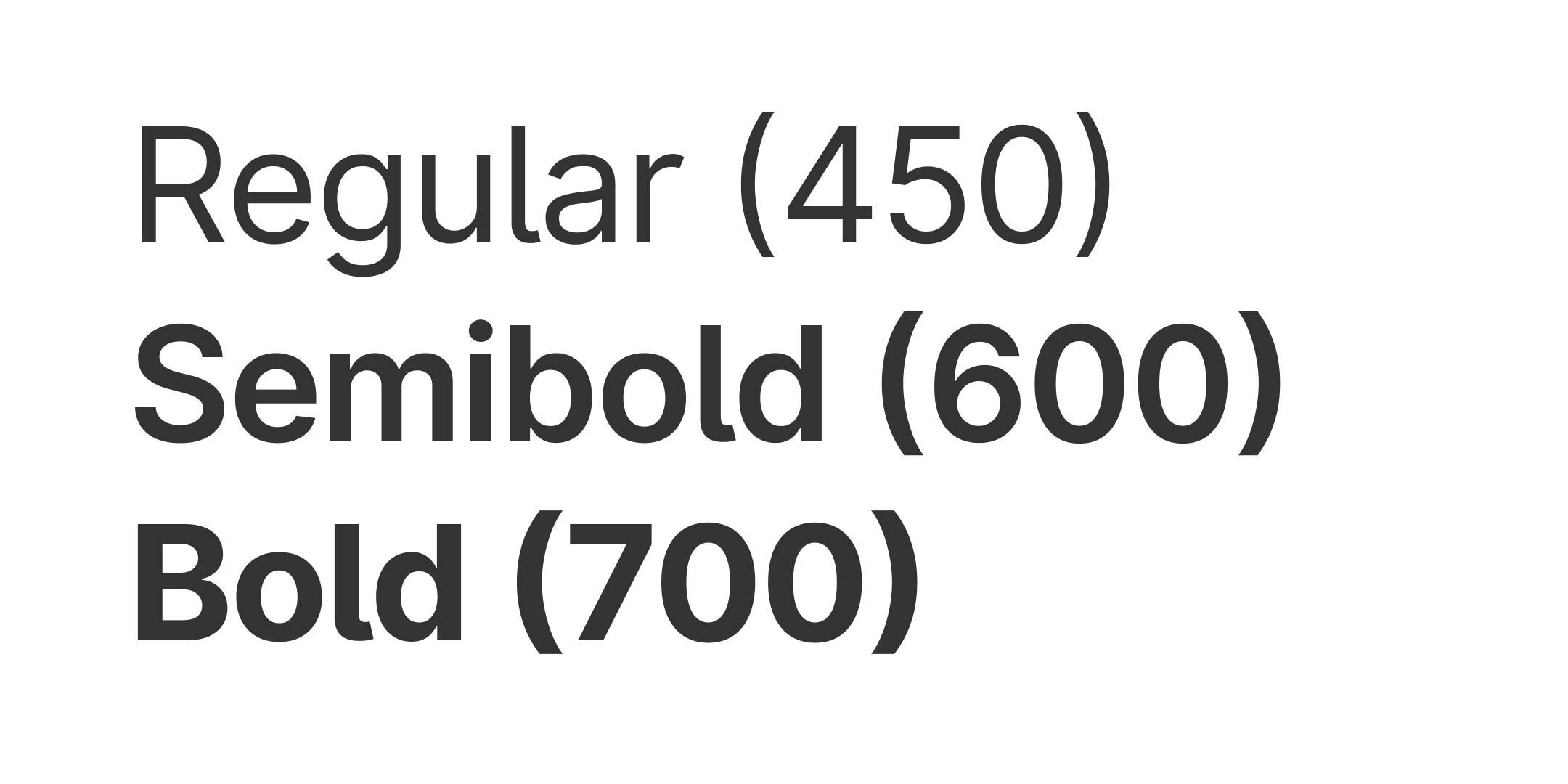
We mainly use the following weights for content:
- Regular (450)
- Semi bold (600)
- Bold (700)

Text Colour
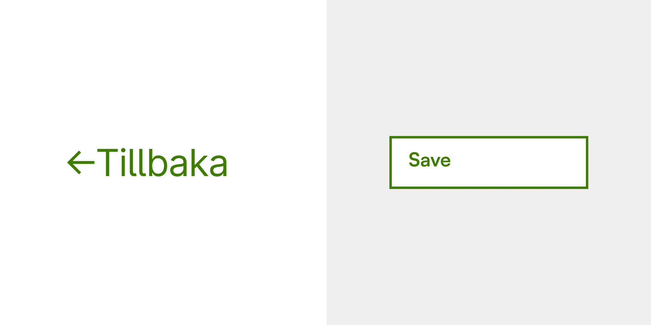
Text colour should be used with care. The rule of thumb is to keep the colour neutral in tables and body text, and green for primary elements that can be interacted with. Colours should not be used for decorative purposes.
