Colours
The colours used in the platform are carefully designed to work as well as possible in different contexts. A consistent use of colours is an important part of the user experience when using the registry. Different colours have different roles that can communicate different things.
The platform's three palettes
The colours in the platform are divided into three palettes with different purposes. The neutral grey scale is widely used to complement the primary green scale. The green scale is mainly used for various interaction objects that you can interact with. Alongside these two are the functional colours which are there to help signal status changes and the like.
When it comes to the use of colour, it is important to remember that colour must never be used as the sole means of distinguishing or explaining a feature, but must always be complemented by text.
Colours and accessibility
Accessibility is an important part of the QReg5 platform. The platform uses the guidelines in WCAG 2.1 AA to satisfy the legal requirements found in the Act on Accessibility for Digital Public Services. It is therefore important that colours and shades in this compilation are used correctly to meet these requirements. For example, the contrast between text and background must be at least 4.5:1 for normal text and at least 3:1 for large text.
See notes at the respective scale for how this can be followed.
The Green palette
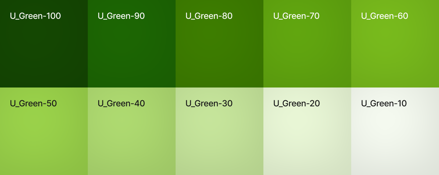
The strong green colour is primarily used for interaction objects in the platform. Buttons for saving/clearing, for example, are in this colour.
Different states
To indicate different states, the different steps in the scale are used. A primary button is in its basic (normal) design Green-80. When you then point over it (hover), it switches over to Green-90, and when you then click on it, it switches over to Green-100 for active.
All values above -80 have a contrast ratio above 4.5:1 against a light background.

Neutral greyscale
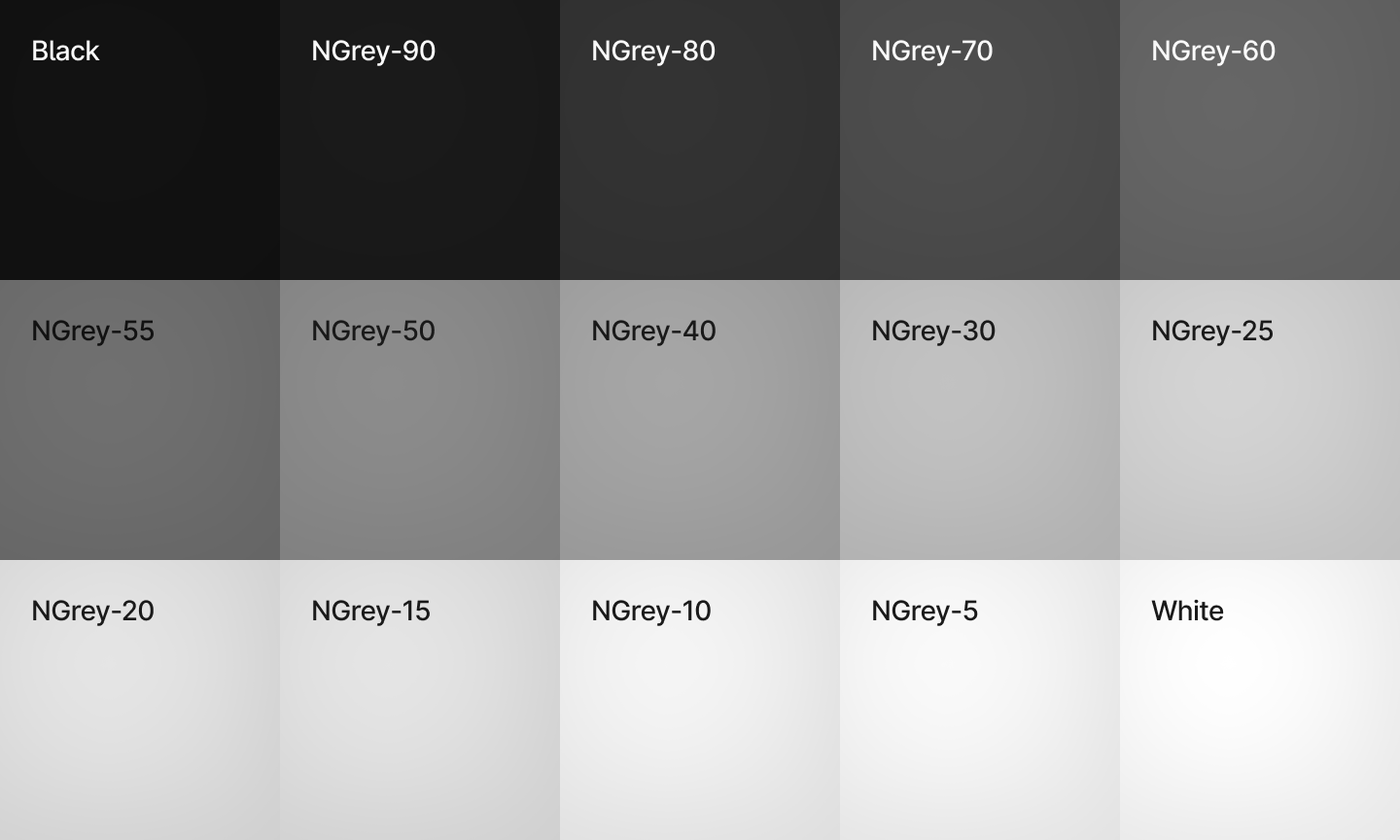
The platform's grey scale is used alongside the green scale to structure content and help users absorb information. The lighter part of the scale is used a lot as background colours and the darker part more for headings and lines in tables.
Values from -55 and up have a contrast ratio above 4.5:1 against a light background.

Function colours
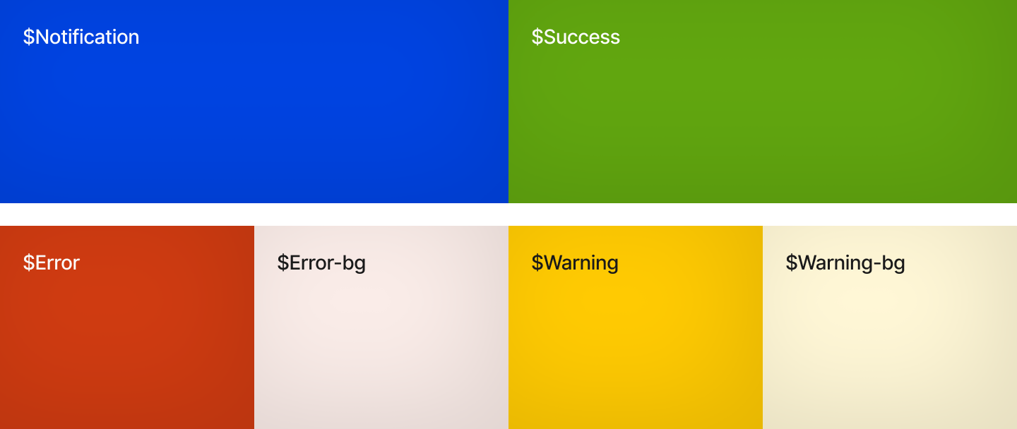
The platform also uses global standard colours for different types of messages to the user. Prompts/information are blue, success/something has gone well are green, warnings are yellow, and various types of errors are red.
An important thing about these colours is that they should not be used in any way other than to convey information in an interaction. The purpose of them is also to deviate from the other colours to alert the user to a change in status.
